How To Make a Great Book Cover
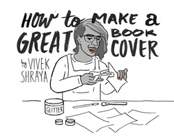
By Vivek Shraya & Illustration by Karen Campos Castillo
The most important lesson I learned when I self-published my first book was that readers do judge a book by its cover. This is often framed as negative but as author and illustrator Annie Mok recently stated on Twitter: “A book cover SHOULD influence your decision about what to buy. The cover is part of the book...Are visuals so deeply disregarded as literacy?” In my experience, an intriguing cover has a greater impact on potential readers than knowing who published the book or even the blurbs on the back. Given the power a cover has to determine whether a book is picked up, bought, and read, I think a lot about covers.
For my own book covers, key design considerations include font choice, colour, consistency with the content, and avoiding being too literal. For my second self-published book, What I LOVE about being QUEER, I wanted to present the book as an unabashed celebration of queerness, so I chose a bright yellow background. In the case of my most recent book, even this page is white, my original idea was to use white text on a white background, but I worried about this being too on the nose.
My second idea was to superimpose the title text on a photograph of myself—white text over a brown face on the cover of a book that addresses racism felt fitting, especially considering how seldom a brown face is seen on a book cover. I felt as though this concept expressed the weight of oppression, but also how that, despite whiteness, brownness comes through, people of colour persevere.
I shared both of these ideas with Oliver McPartlin, the designer at Arsenal Pulp Press, and then onward we went through a series of cover drafts. I am sharing a few of these here to illustrate the process of arriving at the right book cover, which requires a lot of communication and patience from all involved.
I often worry about coming across as a sensitive or difficult artist during this process, but it helps to remember that generally a publisher wants the writer to be happy with their cover. It also helps to be receptive to other ideas. When the font style and colour for the She of the Mountains cover were first presented to me, I was unsure about them, but through the process, I eventually fell in love with the design.
Below are perspectives from the other side of the process—the actual book designers: Oliver, David Gee (a freelance designer who frequently works with ECW press), Michael Solomon (Groundwood Books) and Karen Campos Castillo (a freelance designer who has designed a few of my books).
What are your top considerations when designing a book cover?
Karen Campos Castillo:
I'm very feelings-based, so my top considerations are what I feel is the tone of the book and the direction the author wants to take based on our exchanges.
David Gee:
Is the cover true to the book? Will it make people stop when they see it (and hopefully pick it up)? Is the end result worthy of being featured on The Casual Optimist?
Your CanLit News
Subscribe to Open Book’s newsletter to get local book events, literary content, writing tips, and more in your inbox
Oliver McPartlin:
Beyond the obvious ones (accurately reflecting the tone of the book, communicating the genre/market, making it appealing to the target audience, etc.), I always try to give covers just a little bit of strangeness in hopes that even people who wouldn't otherwise be looking for that type of book will feel curious and compelled to pick it up and check it out.
Michael Solomon:
For picture books, I like to capture theme and character concisely and maybe a bit obliquely; to create a design that is succinct, but also suggestive of the wider world contained within. So the gorgeous interior art is deployed to introduce the theme and title character and show the style of the art execution, but with fires banked a bit, so as not to give away surprises or steal any thunder. Expressive type and lettering help to fill out this demand when you want the art to hold back a bit.
You are often in between the wishes of the author and the publisher. How do you navigate this space?
Oliver McPartlin:
That can be tricky, but I find that you have to treat each project on a case-by-case basis. It's not uncommon for authors to get attached to the one visual approach that they've had in mind throughout the process of writing the book, making them resistant to new ideas. On the other hand, I'm often not as receptive to the author's original vision as I could be, just because I feel like it's my role to start from scratch. Really, the key is for all parties to listen to each other and keep ego out of it in the interest of turning out the best possible result.
Karen Campos Castillo:
Authors tend to be so psyched about seeing artwork and seem so easy to please (bless them), but I understand that a publisher has to pay the bills and they know their business best. A designer's job is to combine all these elements into something cohesive and attractive. Letting go of your own direction or ego is a continuous challenge, but ultimately my job is to make my client happy and that often means compromise.
Michael Solomon:
I work very closely with the editors in negotiating the new creative flux that is introduced once the visual artist is involved. These tensions are not always unconducive to a fertile and creative process. It’s best when everyone has an open mind! Surprising and fresh solutions occur during the design and production processes.
David Gee:
I kind of make it up as I go along, since every piece of feedback is a new piece of information, a new puzzle to solve. Nicole Winstanley once told me that I get covers wrong, but that I get them wrong in the right way. I hold that quote dear to my heart because, in my darkest “What am I even doing?” hour, it reminds me that I can trust my own instincts.
What or who inspires your designs? How do you keep your designs fresh?
David Gee:
I tend to draw inspiration from every other designer I can think of for the execution of the idea. I feed on colour combinations I would never have thought of, type choices that seem counterintuitive, things I would never do but should probably try to do more often. I take it all in, and I get it all wrong again.
Karen Campos Castillo:
I tend to stay away from online design communities; they are generally very white, male and repetitive. I gravitate more towards street art because of the limitations and inherent pressure to be original. Instagram and Tumblr are great for showing what the youth are up to, but I really just try to push myself and my skills always.
Michael Solomon:
Nature and the huge world outside books are a huge source of ideas and inspiration for me. Organic forms and their design-world derivatives are favourites (the classical orders!) Product design. I’m inspired by design that somehow “unthinks" generations of evolution to come up with something strangely pure, elemental but also just right. Art and architecture from all periods, but lately I’m particularly interested in drawings and prints from the 20th century to now. Haunting bookstores and libraries, stalking publishers’ catalogues—these are still the most productive ways to get inspired and, I hope, be fresh.
Oliver McPartlin:
It's probably a minor heresy to admit to, but when I look at design mags and blogs, the main concern is keeping up with current trends, and it results in a really boring homogeneity. But when I flip through Juxtapoz or Hi-Fructose, everyone is bucking the trends and doing their own thing, and that's where things get interesting. That's what I really enjoy about designing book covers—you have a lot more freedom to get weird and subvert expectations than you do with more trend-oriented disciplines like branding or package design.
What is your fave Canadian book cover (and why)?
Michael Solomon:
In children’s picture books, I like How To by Julie Morstad. The approach incorporates both restrained storytelling and a strong, punchy geometric, flag-like design. In the wider world, the encapsulation of a book’s theme by means minimal, expressive, allusive and surprising, as practiced (and theorized) so beautifully by Peter Mendelsund. Enlightenment 2.0 by Joseph Heath (designed by David Gee) remains a favourite of the last few years.
Oliver McPartlin:
I have such a short attention span that I never have a favorite anything for very long. I will say that two Canadian book designers whose work I always really like are David Drummond and David Gee.
David Gee:
I've publicly expressed my admiration for David Drummond for years now. He and I are both ex-advertising people, so I can almost see behind the curtain on his work. I can decode his processes, to a degree. I imagine the brief, and marvel at the results. Recently his work has been getting really loose and jazzy. CS Richardson’s cover recent cover for Jay Hosking’s Three Years With The Rat stands out, and I’ve been liking just about everything coming out of Biblioasis in Windsor.
Karen Campos Castillo:
She of the Mountains by Raymond Biesinger, anything by Jillian Tamaki, and Fifteen Dogs (scared to read it tbh but maybe I just like the cover because dogs lol).
The views expressed by Open Book columnists are those held by the authors and do not necessarily reflect the views of Open Book.
Vivek Shraya is a Toronto-based artist whose body of work includes several albums, films, and books. Her first novel, She of the Mountains, was named one of The Globe and Mail’s Best Books of 2014. Her debut collection of poetry, even this page is white, was released this spring, and her first children’s picture book, The Boy & the Bindi, was published this fall. Vivek has read and performed internationally at shows, festivals and post-secondary institutions, including sharing the stage with Tegan & Sara. She is one half of the music duo Too Attached.
Vivek is a 2016 Pride Toronto Grand Marshal, a three-time Lambda Literary Award finalist, a 2015 Toronto Arts Foundation Emerging Artist Award finalist, and a 2015 recipient of the Writers’ Trust of Canada’s Dayne Ogilvie Prize Honour of Distinction.


