Kevin Stebner's New Poetry Collection Breaks Down the Beauty of Typographical Shapes to Reveal their Inherent Voices
The newly founded Assembly Press has already started making waves on the CanLit scene with unique and exciting titles that will resound with savvy readers, and they've published a real gem in polymath Kevin Stebner. The author, visual artist, and musician has a new book of poetry that stands out this publishing season.
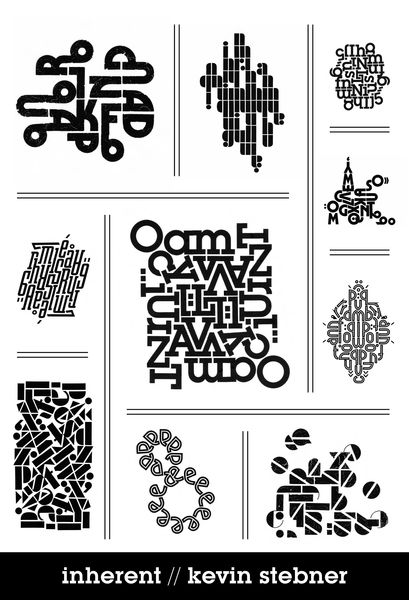
In his new collection, Inherent (Assembly Press), Stebner delves into the foundational elements of Typography, exploring beautiful typographic forms and the inherent voice within these shapes. The poems have been produces by physically scraping each letter onto the page, creating a visual effect that makes the format of the work a kind of poetry in itself.
The project draws from the concrete poetics of Hanjorg Mayer’s Futura and Johanna Drucker, adding elements from DIY punk culture and heavily studied typographic design, all to draw the reader into a singular literary experience.
Read more about this extraordinary work in this Line and Lyric Interview with the author!
Open Book:
Tell us about this collection and how it came to be.
Kevin Stebner:
My fascination with concrete poetry was there prior, mostly from my love of the work of local colleague derek beaulieu and his promotion of concrete poetry (Concrete poetry – some may call it visual poetry – is essentially a mode of writing that emphases not the semantic, what the words are saying, but more focused on the visual aspects of the page, and the building blocks of text, how words, or even characters, are presented on the page). But even as a reader and enjoyer of concrete work, it was the downtime through the pandemic that gave me the impetus to immerse myself in it and try my hand. At first I began with typewriters. I produced a vast array of typewritten concrete poetry, and was fascinated how avoiding computers, using a “dated tool” brought about such varied and unique work. For the work that eventually became Inherent, I tried my hand at another tool, dry transfer lettering, aka Letraset. This old graphic design tool for scratching individual letters onto paper, that closeness to each letter and how those letters present themselves – the book was bourne out of that format and that tool, the unique properties of Letraset that allowed me to see these typefaces and what they wanted to say.
In many ways, it comes from the failure of words that has drawn me to concrete poetry, the difficulty to convey an idea with just words. As a songwriter and player in punk and hardcore bands, I approach it similarly. To say simply, “I’m angry” or “This issue bothers me” - I can say those things, but is the weight of what I’m saying really coming across? But if it’s yelled, played with speed and volume and force, the emotion is conveyed far more resonantly. Rule #1 of (good) poetry (or any writing at all), after all, is “show, don’t tell” - and concrete poetry is ALL show, it does fully away with the telling. That’s interesting to me, how can a poem fully show? Do I need to tell at all?
OB:
Is there an individual, specific speaker in any of these poems (whether yourself or a character)? Tell us a little about the perspective from which the poems are spoken.
KS:
The title, Inherent, came exactly from trying to describe what I was seeking to convey in exploring the different typefaces I used on these Letraset sheets. Pondering if this typeface weren’t constrained by human language, if we didn’t force it to the left margin, if we didn’t force these letters to a straight line across the page, if we didn’t force them into words at all - how then would they speak to us? In the ultimate sense, I was seeking to allow the letters to move as they wanted, to assemble themselves how they would assemble themselves if free to do so. In essence, to seek what was the inherent voice of the typeface itself. Obviously, there is authorial hand in how I put them to page, how I read their movement and wishes. But to answer the question about who the speaker is, the speaker is the typefaces themselves within, and how they wish to present themselves.
Your CanLit News
Subscribe to Open Book’s newsletter to get local book events, literary content, writing tips, and more in your inbox
OB:
What were you reading while writing this collection?
KS:
Interestingly, it wasn’t through reading other concrete poets that brought about the book, but it was more research involving type itself, histories of type, letterpress, graphic design, that informed what became Inherent. Just My Type by Simon Garfield, the Helvetica, Design Canada, Pressing On documentaries. Type encyclopedias, design manuals. The tracking down and poring over vintage Letraset catalogs to see what typefaces were available, and out of that endless hours scrolling of ebay lots and scrapbooking etsy shops to track down elusive sheets. This is what informed the writing, for the most part. It was through readings of concrete poets (derek beaulieau, Steve McCaffrey, Johanna Drucker, Kyle Flemmer, Sacha Archer, PSW, Rosaire Appel, are all among those who have left impressions) that more informed the assembly of the book, how they presented their work, how to think about showing it, how to talk about it to an audience, was where the actual form and layout of the book came about.
OB:
What was the strangest or most surprising part of the writing process for this collection?
KS:
Many of the poems in Inherent are what I refer to as “rotationally symmetrical” - not exactly mirrored (as that would be a flipping on a y axis), but similar joined pieces copied, flipped 180, and slotted together. I found that this kind of shaping of the poems, this compactness of forms, came from the letters themselves. One of the reasons for this (and I don’t know if this is an obvious aspect for some people, as it’s closely related to how our mode of writing goes from left to right) is that, I believe, the roman alphabet is, by nature, clockwise. The way the writing of the curve of a P, the movement of a J and S, the circle of O’s, the letters tend to move clockwise, and rotationally, the poems themselves would curve this way. They would arc, and envelop, and meet back up with themselves. There is a coriolis effect for the roman alphabet too.
OB:
For you, is form freedom or constraint in poetry?
KS:
I didn’t originally envision the books as a whole, as a full-length entity. I rather saw the sections, the “chapters” within, as being their own contained collections. Many of the individual sections in the book began as their own self-contained chapbooks. The sections “Superior” and “Peaceful”, for instance, were previously published as stand-alone chapbooks (from No Press and The Blasted Tree, respectively).
Each section is made up entirely of a single sheet of Letraset. So even the length of how many there are, the size of the poems themselves, by nature of the sheet of Letraset being what it is, it determines the exact scope of the poems that can be built from it.
I don’t know if freedom is the right question to ask when speaking of constraint. Freedom is obviously negated, the choices are much more limited. It’s not freedom that’s the concern, but what’s compelling. Like the Oulipo, for me constraint is a puzzle to be solved. My previous book, Game Genie Poems, is a limited word-length, limited letter lipogram project, a rigorous and strenuous constraint. I have done a chapbook of A-Z acrostics. It’s the dare of “can it be done?”, and “can it be done well”? that’s captivating. Even the tools I use as a concrete poet, typewriters and Letraset, are confining and limited in what can be done with them. But that’s the exciting part, using the limited pieces, and building something beautiful from it. I still view concrete poetry in oulipian mindset as well. It’s still a puzzle, and a challenge. A single sheet of Letraset is the constraint - what can I build with it?
___________________________________
Kevin Stebner is an artist, poet and musician. He produces visual art using old videogame gear, and produces music and soundtracking with his chiptune project GreyScreen, post-hardcore in his band Fulfilment, as well as alt-country in the band Cold Water. Stebner has published a number of typewriter visual poems and other concrete work in chapbooks. He is also the proprietor of Calgary’s best bookstore that’s in a shed, Shed Books. Stebner lives in Calgary, Alberta.
